


Color and the World of Ascender

Hey guys, I’m sorry I missed sending out a newsletter last week. I’ve been pushing myself to get at least one of these sent out every week because without deadlines, even arbitrary self-inflicted ones, I will do nothing, but I was just struggling to find something to talk about, or at least something I thought would be both interesting for you all to read and for me to write about. The time off helped me come up with some stuff, so I should be good for a while, but in the future, if you notice me miss a week, it’s simply because I’m recharging my juices and trying to generate some new ideas.
With that said, what I want to talk about today is actually something small and specific, but something that really heightened a recent story for me: I want to talk about the color red.
Specifically, I want to talk about the color red in issue 11 of the comic book Ascender. For a little context, Ascender is the sequel to a series called Descender, published by Image comics, written by Jeff Lemire, and illustrated by Dustin Nguyen (though they’re listed as co-storytellers in the credits to acknowledge their equality in creating the series and world and its story). Descender was the tale of a world reeling from an attack by cosmically unfathomable robotic enemies, and Ascender picks up about a decade after the end of the previous series, following the surviving cast and their children in a world very different — but just as dangerous — from what came before.
Now Jeff Lemire is a great writer, and I could easily devote a whole newsletter to talking about my favorite series of his (such as Trillium, Plutona, and Royal City) and the way they mix high-concept ideas with down-to-earth, incredibly human conflict and drama, but if I’m being honest, I think Lemire’s greatest skill as a writer is his ability to find the perfect artistic partner for his project, then get out of their way and let them tell the story. That sounds like a back-handed compliment, but I swear it isn’t; it takes legitimate skill (and not to mention a great reputation) to be able to find just the right artist to elevate your story, and even more to be humble enough to let them do it. I’m sure it helps that Lemire is also an artist himself, but he never bogs his writing down with excessive words, and allows his artists plenty of space to not only put their personal stamp on the series, but to let their actual art itself be the main attraction. I’ve gasped at twists in Lemire’s stories, but I’ve just as often gasped when I’ve turned the page and seen one of the landscapes his artists have drawn.
This certainly applies to Descender and Ascender. Again, I enjoy the stories these series are telling, especially Descender, which used its sci-fi premise to tell a nuanced tale about discrimination, the destructive cycles it creates, and how impossible it can be to break those cycles. Descender’s main character was a tiny robot named Tim-21, one of the last of his kind, chased across the universe by those seeking to use, abuse, and/or destroy him. Tim was a reactive character; with the mind of a literal child, he didn’t drive the plot so much as the plot drove him, with him reacting to each new threat that came his way without being able to do much to attain his own goals or protect himself without relying on others. The success of the series depended not only on readers rooting for Tim-21, but on them wanting to protect Tim themselves, in becoming invested in his safety above all else.
That’s where Dustin Nguyen came in.
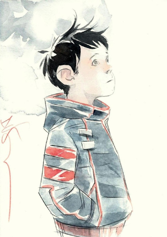
Nguyen came to prominence in the world of comics working with younger characters and all-ages properties, most involving Batman’s sidekicks over at DC Comics; his work on Streets of Gotham was some of the first to help humanize the then-new Robin, Damian Wayne, and help him be viewed as an actual ten-year-old child and not the adult in a child’s body some other writers portrayed him as. While Descender and Ascender are not all-ages books, his experience creating adorable, sympathetic, realistic looking young characters paid off handsomely with his design for Tim-21. The young robot looks tiny, innocent, and fragile, sweet and trusting. From the very moment I first saw Tim-21’s design in an ad for Descender — months before the first issue premiered, mind you — I was invested in the character and worried for his safety. Descender just would not have worked without this design.
Yet Nguyen’s art elevates these series in other vital ways as well. Nguyen designs an endless variety of otherworldly creatures and landscapes, but it’s often his watercolor paints that truly brings them to life. Many of the backgrounds and characters are purposely kept dark and dingy, be it antiseptic command rooms, rusted, decimated space stations, or dank, musky swamps full of sickly-pale vampires; they show how dark, dangerous, and worn-down this universe is, but they also make moments of true beauty shine even more. It’s not just Nguyen’s skill, but also their relative rarity that make landscapes like the following, from Ascender 11, pop.
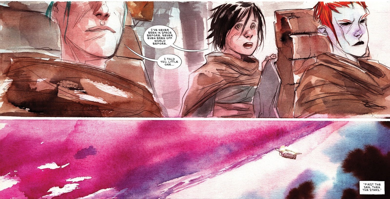
It’s young Mila’s first time in space, so the sight of that deep red and purple atmosphere is supposed to be awe-inspiring for her, but after an issue spent fighting on dingy rocks and dark metallic ramps, they’re a welcome bit of gorgeous color for the reader as well.
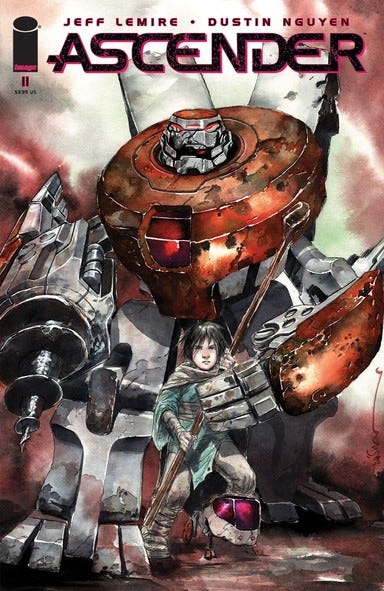
But like I mentioned before, the color that stood out to me the most throughout this issue was the color red. It’s not a color that tends to show up a lot in Ascender, and when it does it’s usually a darker hue. When Driller attacks a squad of monsters late in issue 11, their blood is so dark that it’s mostly black, with only a few red highlights. Then there’s the cover; the only red is the eyes of two robots, both small and not standing out much.
Throughout both series there has been one constant source of bright red, though, and that’s Captain Telsa.
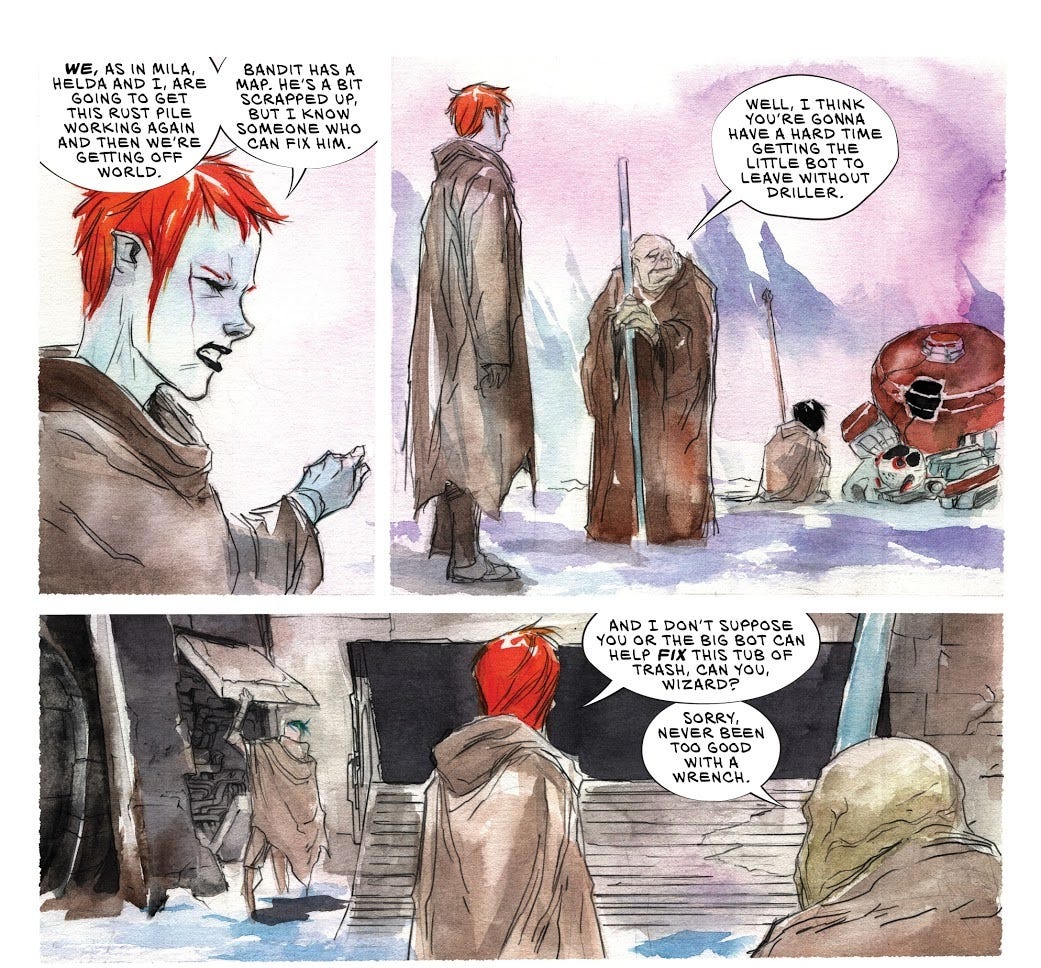
Her unnatural hair and skin color is never commented upon or explained (her father is a Caucasian human/humanoid), but these attributes make her stand out. To readers it marks her as a character to watch and helps exemplify her ferocity and fortitude, but in-universe it marks her as different, and is likely part of the reason Telsa feels like such an outsider and has such a strong desire to prove her worth to everybody around her (but especially her father).
As unusual as Telsa’s hair is, though, it’s also still bound by human constraints. Nguyen surrounds it in a black border and gives it white highlights; it’s an unusual hue, but it still follows the laws of physics that everybody else’s hair follows in Ascender. The same can’t be said for the character the issue only identifies as “sister,” the literal sister of the series’ villain thus far, a powerful witch and tyrant known as Mother.
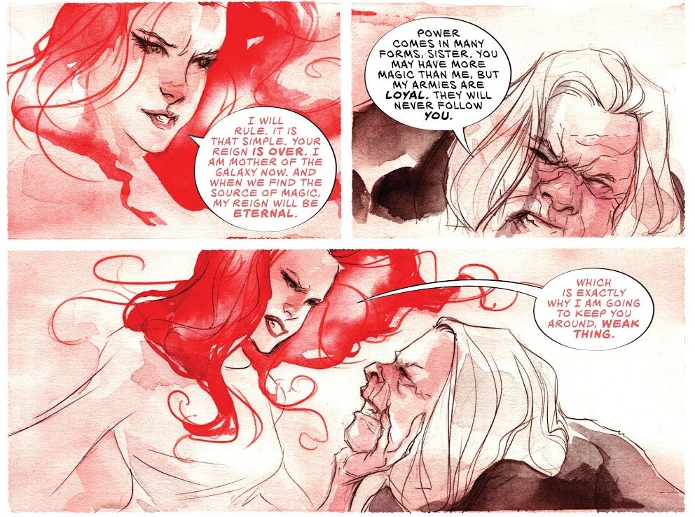
Sister is even more powerful than Mother, and her hair is the most obvious and immediate sign of not only her power, but her supernatural otherworldiness, of the kind of power and presence no other character in the franchise possesses. It doesn’t follow the rules; not only is it a rare color for this world, not only does it float freely on its own, but it isn’t constrained in the same way as Telsa’s. There’s no outline, no borders to her hair. It’s as if Nguyen applied the color directly to the page without any sort of guide.
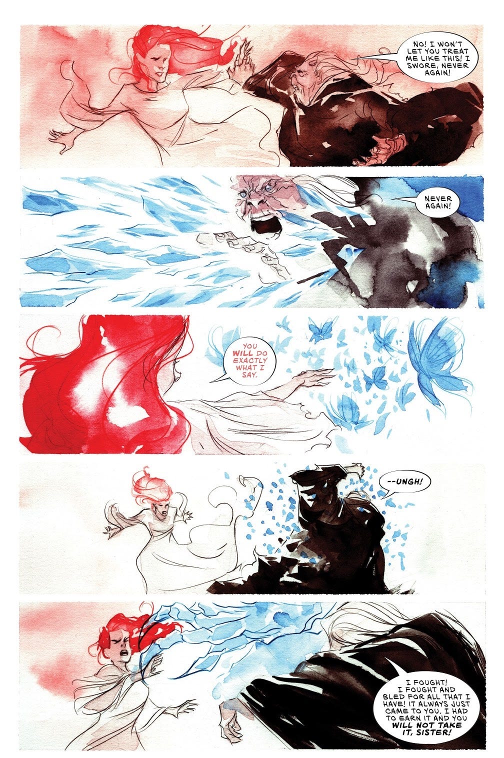
Red is a color that evokes intense power and emotion, and thus it quickly becomes Sister’s signature color. She speaks in red; red vanishes entirely from the page when Mother attacks Sister with her icy blue power; when she uses her own ability red fills the background like an omnipresent haze, and her magic manifests on Mother in the same color and consistency as her hair.
If I ultimately have any grand conclusion from this, it’s not necessarily going to be about the color red itself. Red is what caught my eye in this particular issue, but Nguyen’s skill means that any other color could be just as rich with meaning in any other issue. What I really take away from this is that any illustrator worth their salt will use every tool in their arsenal to make their art pop and fill it with meaning — and Nguyen is certainly an artist worth plenty of salt.
CHECK OUT
Outside of comics, I’ve been reading a lot of memoirs over the last couple of years. This past week I checked out Hollywood Park: A Memoir by Mikel Jollett. It’s a harrowing and often upsetting tale about Jollett’s early years in cult orphanage and, later, his childhood with his narcissistic mother. It’s about the lifelong damage such figures can create, about the work it takes to repair such damage, and the rewards you can find by doing so. It’s also about the power individuals have to make a difference in a person’s life, and in this case, it’s Jollett’s father who gives him the strength to turn his life around. This was a tough but incredibly rewarding read, and that makes it one I can’t help but to recommend to all of you as well.
ABOUT
“Do You Know What I Love the Most?” is a newsletter from Spencer Irwin. Spencer is an enthusiast and writer from Newark, Delaware, who likes punk rock, comic books, working out, breakfast, and most of all, stories. His previous work appeared on Retcon Punch, One Week One Band, and Crisis on Infinite Chords, and he can be found on Twitter at @ThatSpenceGuy. If you like this newsletter, please subscribe and share with your friends!